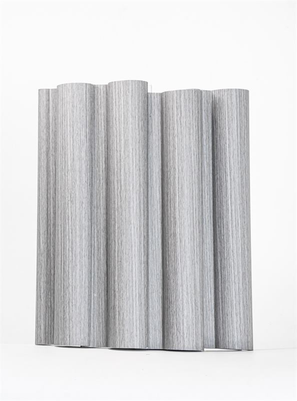
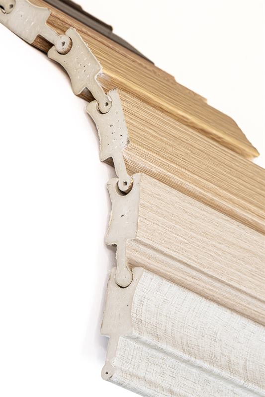
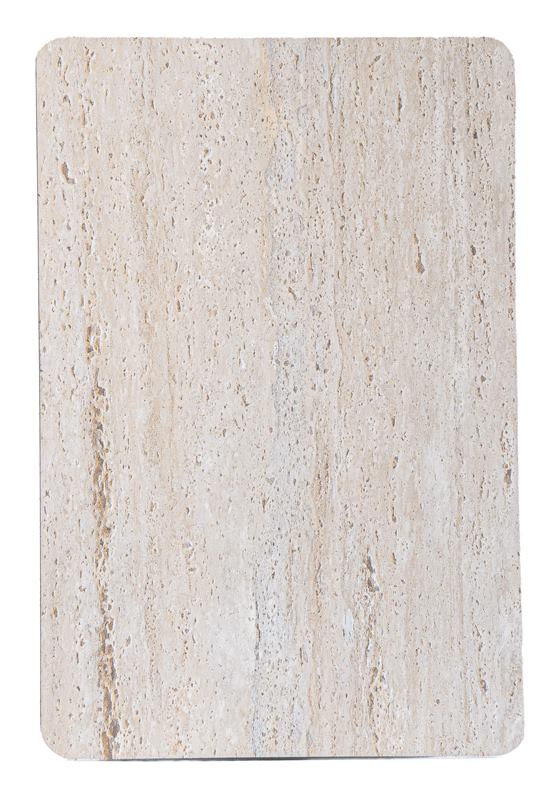
The colour of your cladding completely changes how a space feels. In this guide we show you our real samples and share ideas to help you choose.
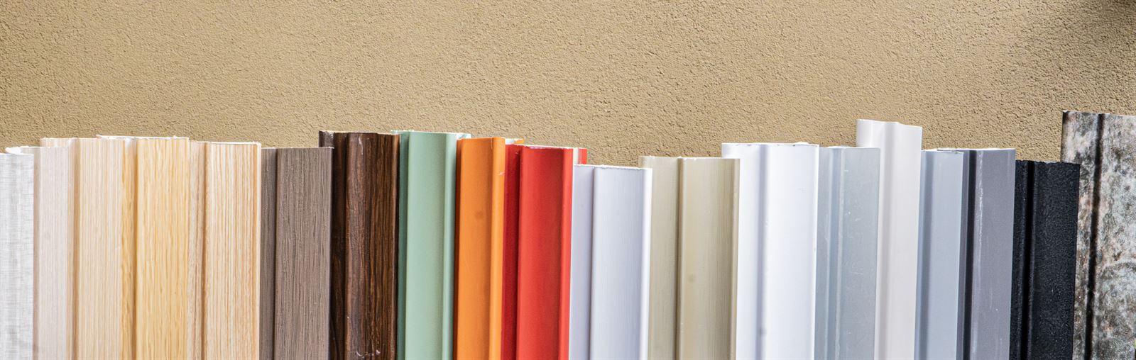
Woods: warmth without maintenance
Wood finishes are the most requested. Light woods make a space feel larger and dark woods give a more sober, elegant feel.
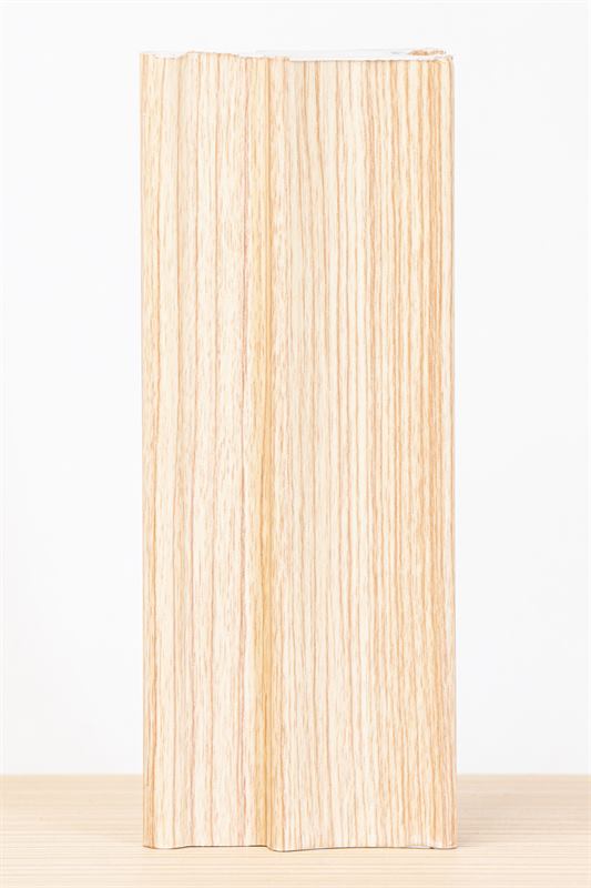
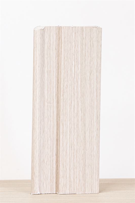
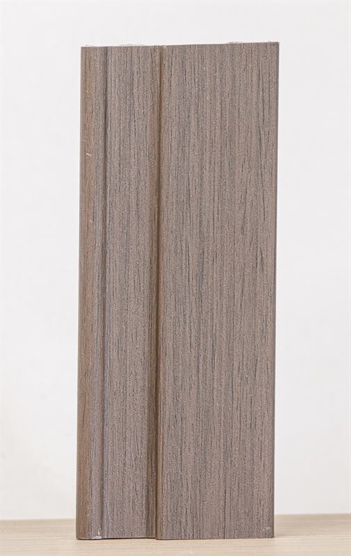
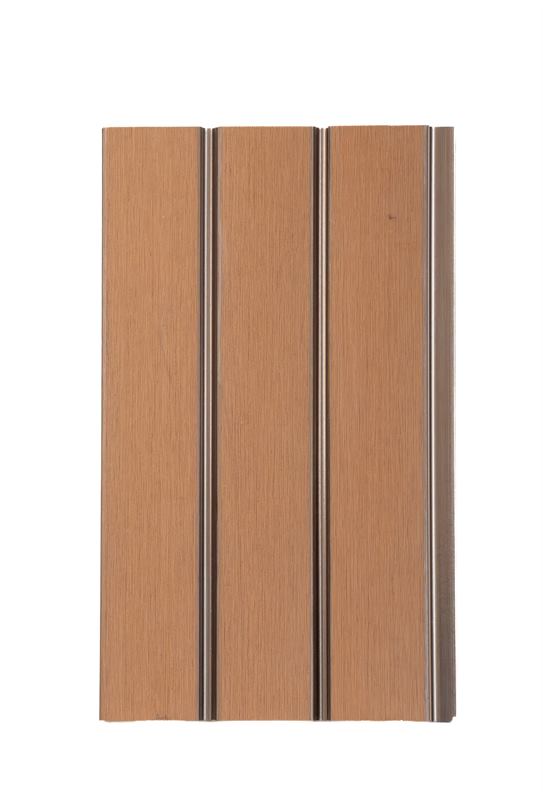
Great for: living rooms, bedrooms, headboards and offices looking for a warm atmosphere.
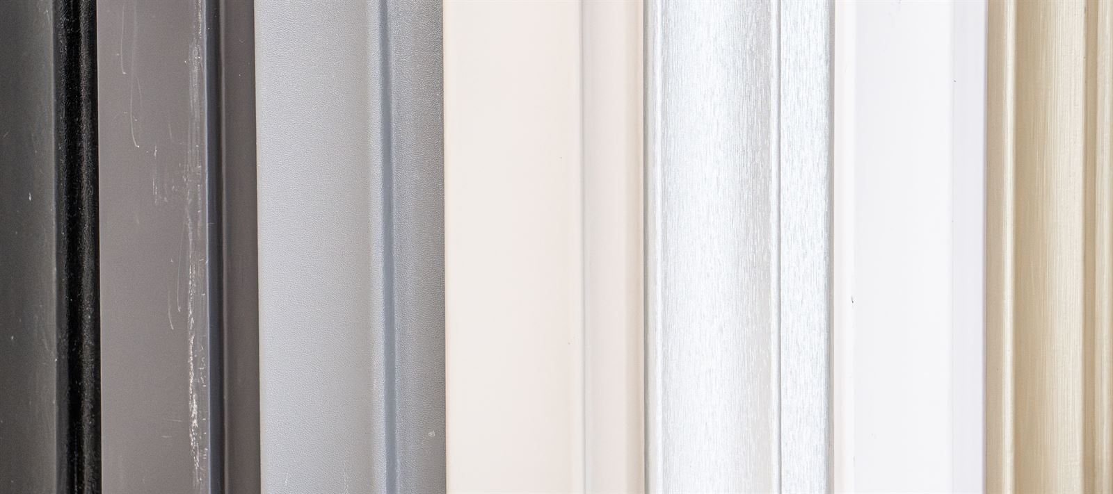
Neutrals: whites, greys and black
Neutrals go with everything. White and pearl white brighten a room; greys add a modern touch and black creates contrast on feature walls.
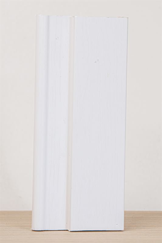
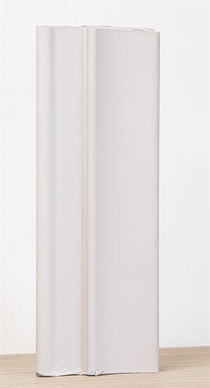
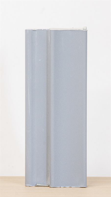
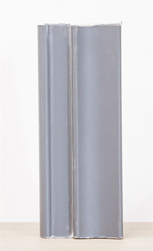
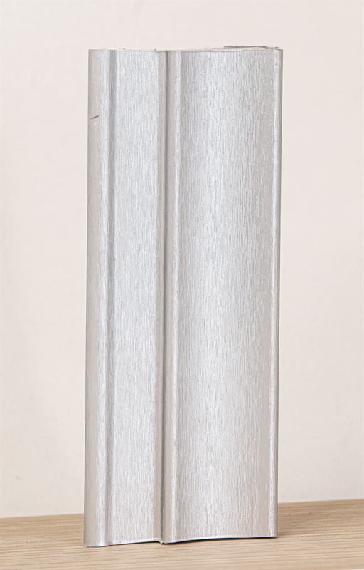
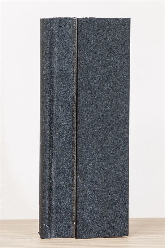
Great for: small spaces, offices and shops.
Bold colours
Sage green, orange and red turn a wall into the star of the room. Use them on a single wall or a piece of furniture so the space does not feel crowded.
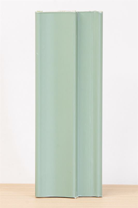
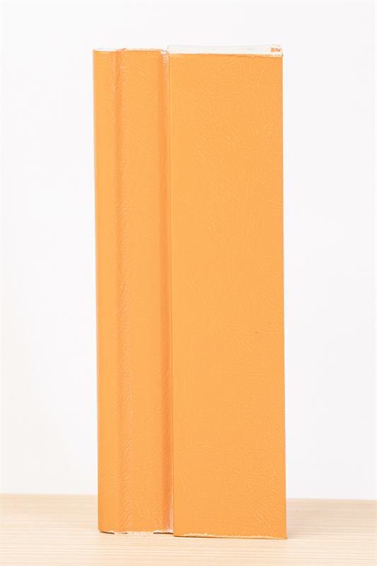
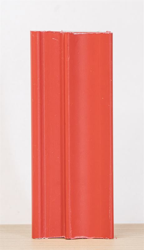
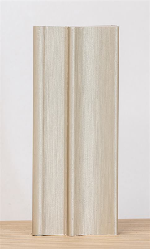
Great for: cafés, shops, kids' rooms and feature walls.
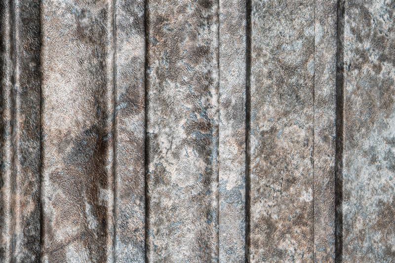
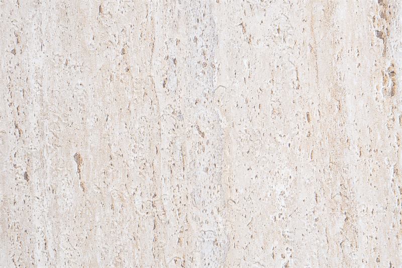
Textures: stone and fabric
Stone and fabric finishes add visual texture to smooth surfaces.
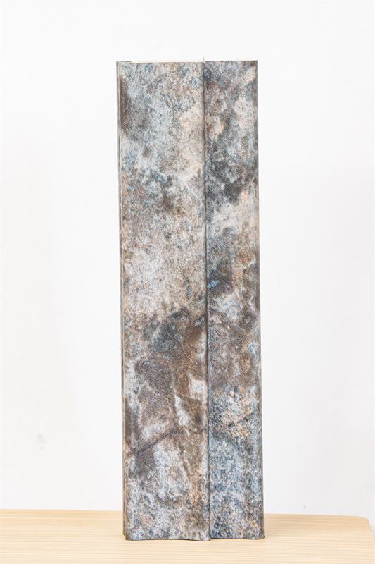
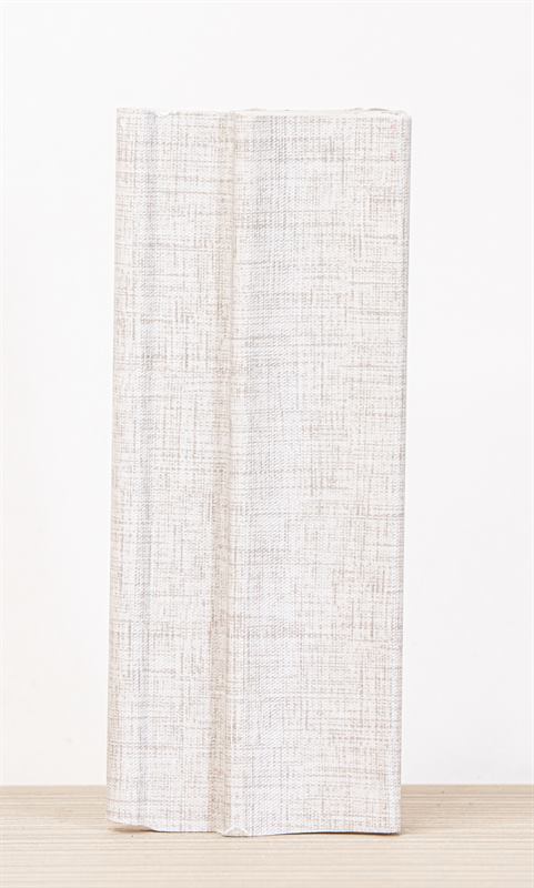
Tips for choosing
- Check the light. The same colour looks different in daylight and under warm light at night.
- Think about the floor and furniture. Choose a tone that matches, or one that contrasts on purpose.
- Small spaces: light tones and vertical slats to gain height.
- A feature wall is a safe way to try bold colours.
- Try it first: use the wall visualizer to see the material and colour on a wall.
Ask for your quote
Once you have chosen a colour, send us the measurements and the finish name on WhatsApp. Not sure which material to pick? Read about the WPC fluted panel, the carbon PVC panel and flexible MDF.